Africa is bigger than your map: why the continent looks small, and why it matters
At 30.3 million square kilometres, Africa is about 14 times the size of Greenland. On the world's most familiar map, the two look the same.
Lire cet article en français →
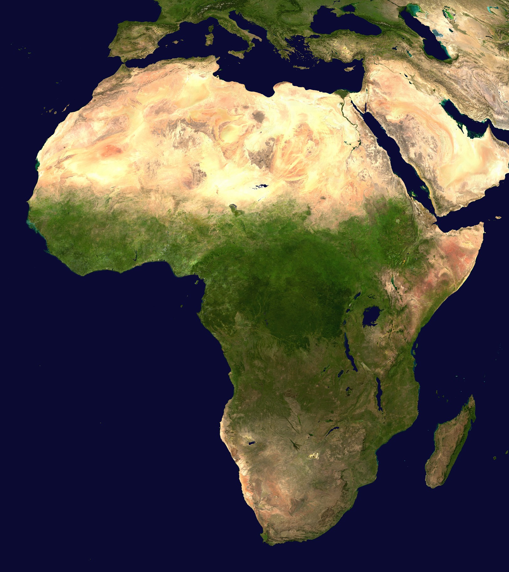
PANM — Africa covers about 30.3 million square kilometres, including its islands. That is around a fifth of all the land on Earth, and it makes Africa the second-largest continent after Asia. Yet on many of the world maps people grew up with, Africa looks no bigger than Greenland.
The map that shrinks Africa
The reason is the Mercator projection, a map first presented by the Flemish mapmaker Gerardus Mercator in 1569. It was designed for sailors: any straight line drawn on it is a line of constant compass bearing, which made it the standard map for navigation from the 18th century.
To achieve that, the Mercator map stretches land more and more the further it lies from the equator. Places near the poles, such as Greenland and Antarctica, look far larger than they are. Africa, which straddles the equator, gets almost no stretching at all.
The real sizes
- Greenland looks about the same size as Africa. In reality Africa is 14 times larger.
- Greenland's true area is close to that of the Democratic Republic of the Congo alone.
- Africa looks about as big as South America. It is more than one and a half times as large.
A continent asking for a fairer map
Use of the Mercator map for anything other than sea charts fell during the 20th century, then came back with online mapping. As of 2025, the African Union backs a campaign, led by Togo, for schools and institutions to use the Equal Earth projection, which shows every country at its true relative size. Togo's foreign minister Robert Dussey has called it "a scientific discussion".
Africa is also the youngest continent: its median age was 19.7 in 2012, against 30.4 worldwide. A big continent, with a young population, is worth seeing at its real size.
Background: Wikipedia.